

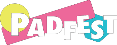
Padfest is an independent festival originally curated for a group of friends that over two years developed into a 250 capacity festival.
Their ethos applies to those who are "adventurous, trustworthy and caring individuals who like to party" and those "who care for the environment the visuals as much as the music".
After being approached and understanding the ethos the client, Padfest was looking for a long lasting branding along with a "mascot" that could be used for marketing purposes. They needed to appeal to an older audience who revelled in the childlike escapism that festival culture offers but also be cool and trendy to attract new communities. The option to expand their brand across media and tech formats was important to the Padfest team as they wanted to open up the possibilities of developing their own app.
I started working on defining a strong and fun colour palette that could be utilised in all forms of media.
The standard #FFFFFF White and #000000 Black have been adopted to ensure that black and white print media standards could be adhered to, along with any text that may be overlapped in any of their future apps.
Moving into #1D1D1D Black for UI and colour print purposes provides a softer and less harsh tone when utilised for dark mode also balancing a less contrasting difference when used alongside the pastel colours.
#94CBA2 Green was chosen to be the flagship background colour, echoing the landscape that festival goers attend. After choosing this I knew that I wanted three very primary feeling colours, something that would spark a youthful and child like emotion.
#EBEA5E Yellow, #ED689A Pink and #27BDCE Blue became the three colours that not only sparked a childlike sense of play within me but also reminded me of the small blocks you often see children playing with, thus firmly cementing themselves to the sense of wonder and discovery the brief outlined.
#1D1D1D
#EBEA5E
#ED689A
#27BDCE
#94CBA2
#FFFFFF
#000000
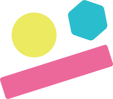
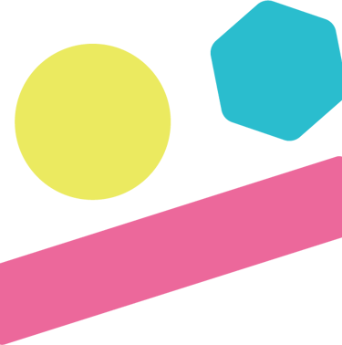
Following on from the spark of childlike wonder and the reminded emotion of playing with blocks, I started to create simple shapes that could be used as icons, page dividers, 3D loading assets or even to be incorporated into the logo.
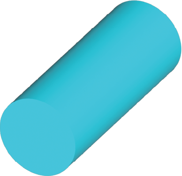
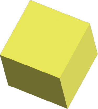
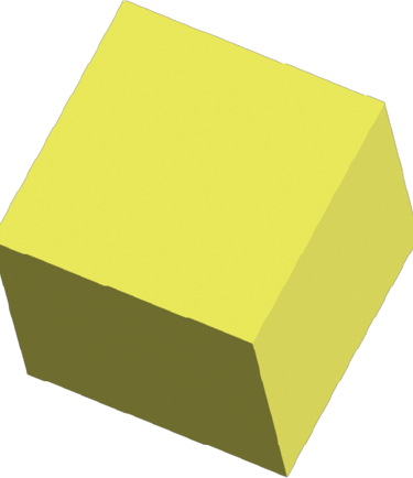
The shapes however had to be even simpler, as a child wouldn't be able to tell you that each shape was a "cube" or a "cylinder" and I wanted to continue this sense of simplicity across the design.
Whilst the cubes 2d face is a simpler square shape, I felt this offered too harsh an edge and didn't seem dynamic and exciting enough. Running with this thought pattern, I adopted rounded edges to give a friendlier feel for all the final objects, eventually settling on a circle, a rectangle and hexagon.
SO HOW DID YOU DO IT CHAMP?


Colour
Shape

The font had to be clear, concise and to the point. Whilst the aesthetic was childlike, consumers were not. This juxtaposition was not something that needed the likes of a serif font but certainly needed to be grounded enough that any lettering could be altered and still be legible.
Taking these factors into account I opted to utilise the Futura PT family.
Adjusting letters within this family as a common trend that would identify the brand was the next challenge. Futura is a free Adobe CC font and would lack the uniqueness.
Combining the festival tent along with the letter A, I created a symbol that could be used in its place (See transformation image) this Tent-A, is unique to this brand, in line with the previous shapes created all whilst giving a unique marketing effect.
Tent-A could also be used as an app icon later in the brands development should they chose to do so.
Font
FUTURA PT
FUTURA BOLD
FUTURA DEMI


Logo
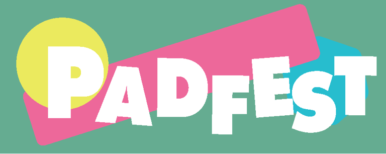
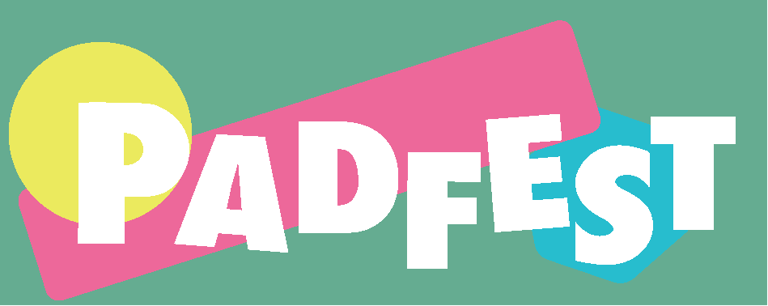
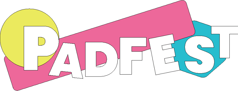
Finally combining all the pieces felt like it should have been an easy task, however after many iterations and specific placements of individual letters I decided to look to the wider world for experience. Looking back at old drawings that myself and my siblings had done would hopefully provide me with the insight into being a child again, the way that the lines were not clean cut, the bubble fonts, the memories of falling over, the crumpled paper... All of this provided me with (unbeknownst to me in the moment) the perfect amalgamation and understanding that would bridge the gap between the childlike explorer within me and the grown up "artist".
After adjusting the letters to feel more "placed" than "shaped", arranging the shapes behind the name "Padfest" and giving all the text and shapes a thin stroke it would provide the brand with the essence of never losing your childhood but always knowing that you were grown enough to colour within the lines.
1
2
3
4
Character
Ideas quickly become doodles and sometimes old doodles become ideas.
One of my most unthought of but prominent factors whilst being at a festival is the idea of "losing everyone". With groups going out of their way to have meeting spots, flag poles and safety spots you inevitably want to spend time with your friends and not fall into the trap of being alone. However this festival promotes exploration, and by questioning the norm I questioned who or what would benefit most from this?
I came upon the idea that the best superpower to have at a festival would be the power of teleportation. It would solve a lot of the wandering souls who venture off paths and stumble into tents' issues.
Teleportation. Lost souls. Exploration.
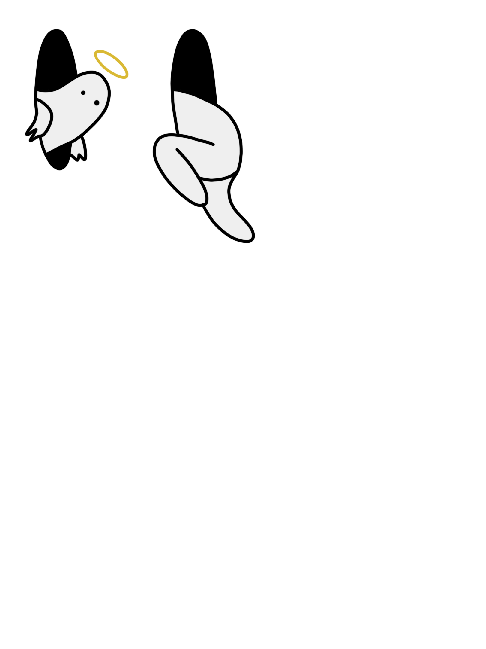
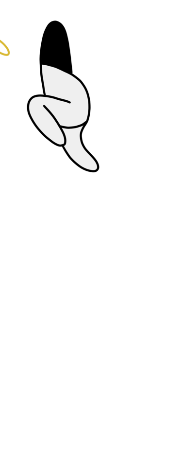
What if there was a cheeky but innocent soul who could teleport? Showing people secret doorways to stages that no one else knew, guide people ready for bed back to their tent and instantly take those looking for adventure to the next place?
well, that's how this soul was birthed. Able to be placed anywhere on any promotional material and still be super effective, even be used as a mascot for guerilla marketing campaigns. A simple yet effective costume that has no gender or race. Just a soul looking for a good time, in every dimension.
Maybe you could become this soul?



So what did you think?
Let me know by sending me a message through the connect button below!
